Making the Icons Feel Like They All Came From the Same Kitchen
Kawal Oberoi & Maitreyi Chavan
|
Design
7 September 2026
Good icon systems are easy to overlook. Great ones make an interface feel like it could not have been designed any other way. Icons may be subtle, but they can make an experience easier, add a touch of delight, and while doing so, forge an identity beyond the basic visual identity parameters.
When we started working on Posha’s icons, we had a growing library of generic icons that worked individually, but together felt like they came from different visual worlds. As the product grew, so did the number of places icons needed to live, from tiny dietary markers and UI controls to categories, actions, celebrations, and instructional diagrams.
The challenge was to create a system that could handle all these jobs while still feeling unmistakably Posha.
Starting with what makes Posha, Posha
We went back to the nature of the product itself. Posha lives somewhere between a kitchen and a machine room. Ingredients go in, the system makes sense of them, and somewhere along the way, photons become instructions, instructions become cooking, and eventually, dinner.
That led us to a simple question: what would an icon system feel like if it came from the same world?
We explored several visual directions. We narrowed it down to three directions, each with its own personality. One leaned into crisp, organic cuts. Another explored finer details and softer curves. The third took a more playful approach, with forms that felt a little less serious.
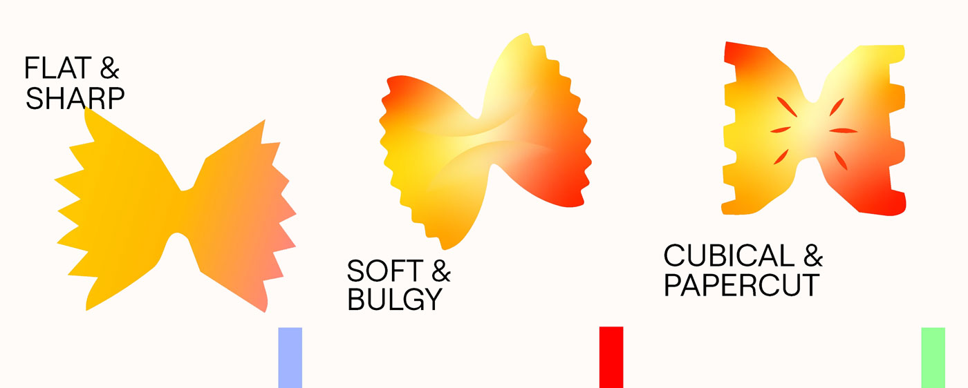
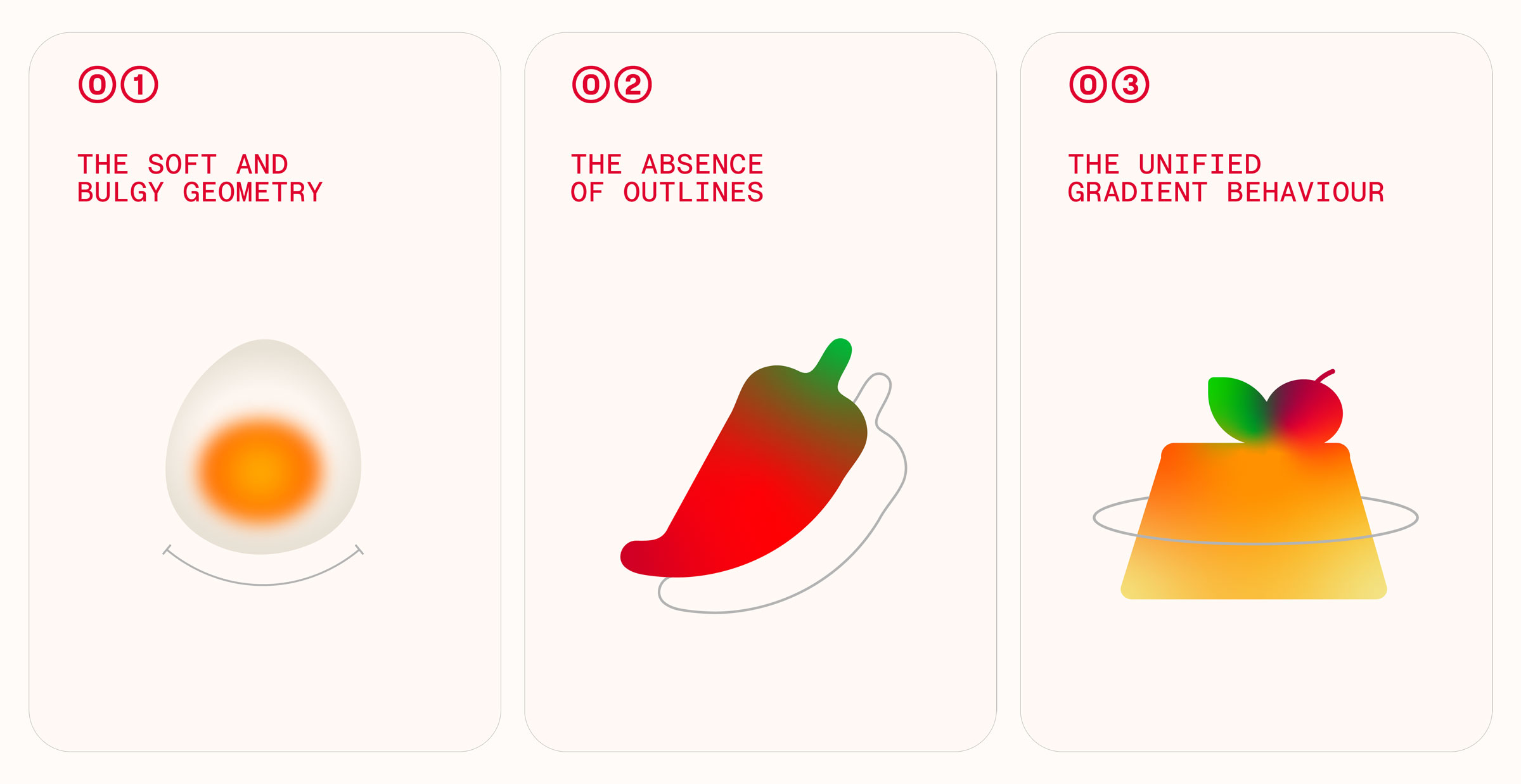
The direction that stuck was softer, plumper, and more food-like. Fresh, rounded forms. Things that looked less like diagrams and more like they might be good to eat.
It gave the system a personality without making the icons harder to understand.
Meaning first. Geometry second.
One of the interesting constraints was that these icons had very different jobs.
Some needed to disappear into the UI. Others needed to attract attention. Some represented broad categories, while others communicated a specific action or celebrated a moment. And some had to behave almost like instructional diagrams.
We solved this on two connected levels.
First was semantics. The icons needed to be immediately understandable: a heart should read as a heart, a calendar as a calendar, and a bowl of soup should actually suggest soup. We favoured the obvious answer. A heart should look like a heart. A calendar should look like a calendar. There is a time for cleverness, but an icon is rarely it.
Then came geometry: how could all these different meanings still look like they belonged to the same family?
We developed a common geometric language around broader, rounded forms. The proportions had a natural connection to Posha’s visual identity and, importantly, to food itself.
There is something inherently appealing about the plumpness of fresh food, and we wanted the icons to carry some of that quality.
The real craft was in marrying the two, preserving the meaning of each icon while giving every icon the same visual DNA.
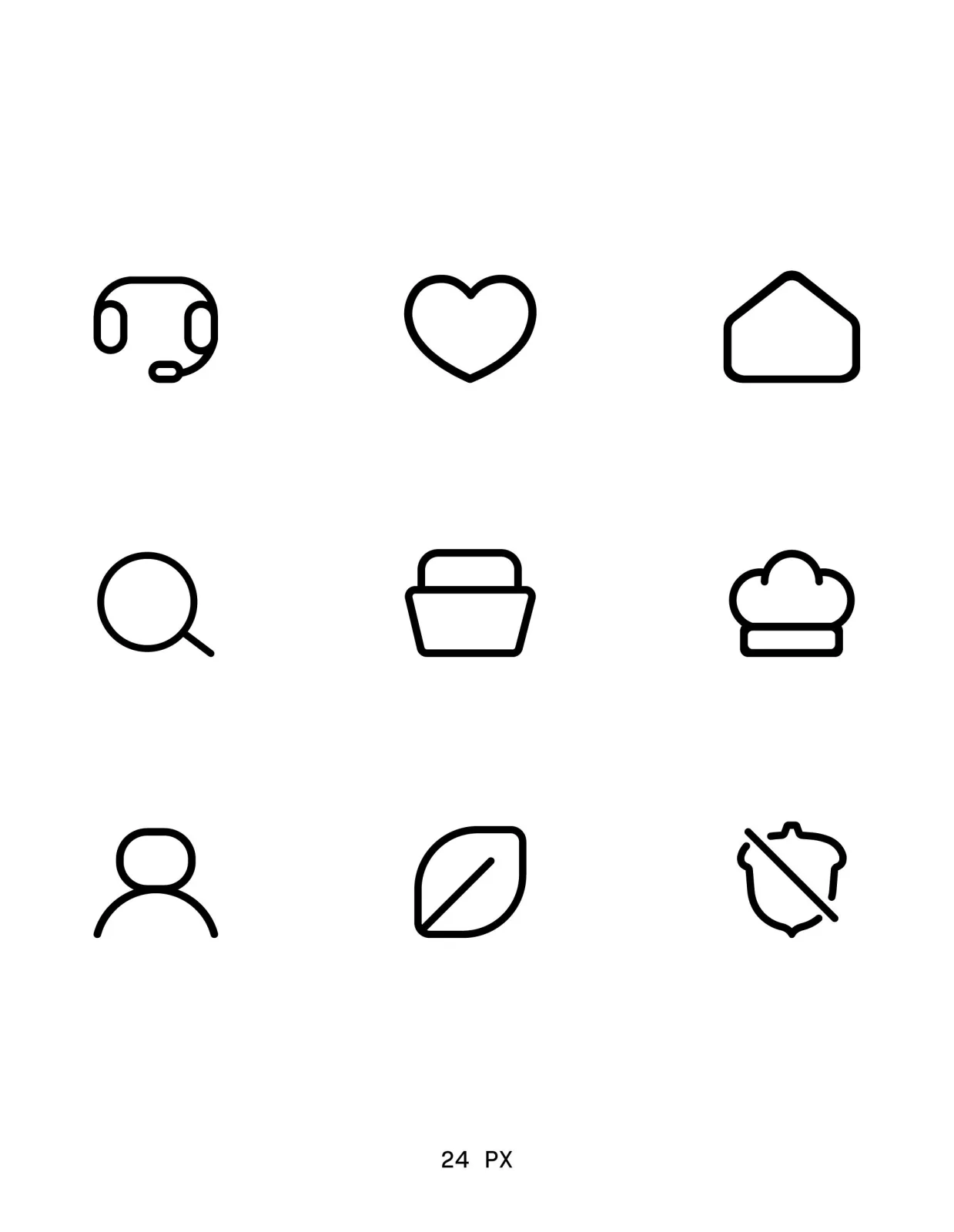
Line Icons
The details that make a system
For the line icons, we created a grid and a consistent line weight. But consistency on paper is not always consistency to the eye. At different sizes and combinations of curves, corners and shapes, optical adjustments become necessary.
This is where the work started to feel a little like type design: small decisions that are easy not to notice individually, but become very noticeable when the whole system is put together.
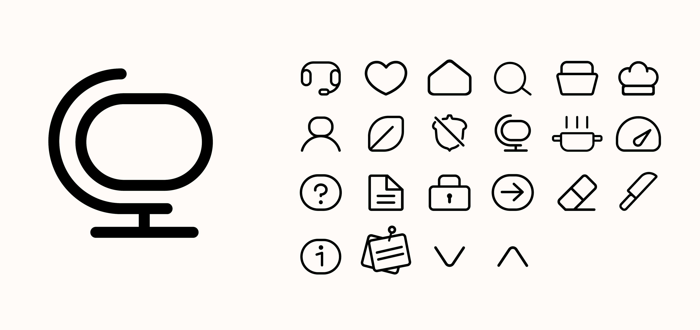
We tested, adjusted and fine-tuned the geometry so that the icons could work across their different sizes and contexts without losing their character.
Colour that blends across, yet creates boundaries
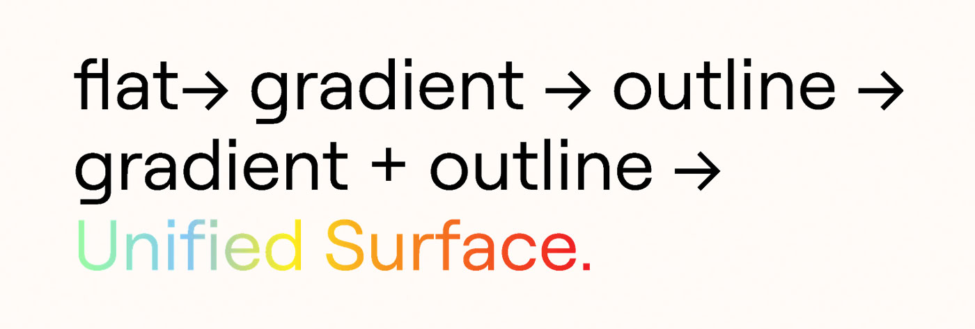
The filled icons introduced another layer.
Instead of relying on outlines and hard boundaries, we used Posha’s colour palette as part of the geometry itself. Colours could bleed into one another through soft gradients, creating boundaries without drawing them explicitly.
The result was a single unified shape where light, tone and colour do the work an outline normally would.
It also felt strangely appropriate for a machine that deals in food. Less interested in drawing every last detail, more interested in what happens when ingredients, colours and flavours start getting together in the same pan.
Take something like caramel custard with a cherry and a little leaf. Rather than treating each ingredient as a separate outlined object, the entire symbol can exist as one shape. Cherry red, greens, yellows and browns transition into each other while still retaining their individual meaning.
That became more than an icon treatment. It became a recipe for illustration.
From a library to a language
The system eventually became a library of 200+ custom icons and illustrations, but the number is not really the interesting part. What mattered was creating rules that could generate the next icon too.
The same geometry, colour logic, proportions and level of detail could extend from the smallest UI icon to larger, more expressive illustrations and instructional visuals. That made the system scalable in the number of things it could communicate.
We tested the system in the app, where the real edge cases showed up. More rounds of fine-tuning helped the icons work across sizes and contexts while continuing to feel like one identity.
The result is an icon system that is deliberately simple at first glance, but has quite a bit of thinking underneath it.
Good design is a little like good cooking. Nobody needs to know what happened in the kitchen. They just need to enjoy the meal.